Spring Color Palettes
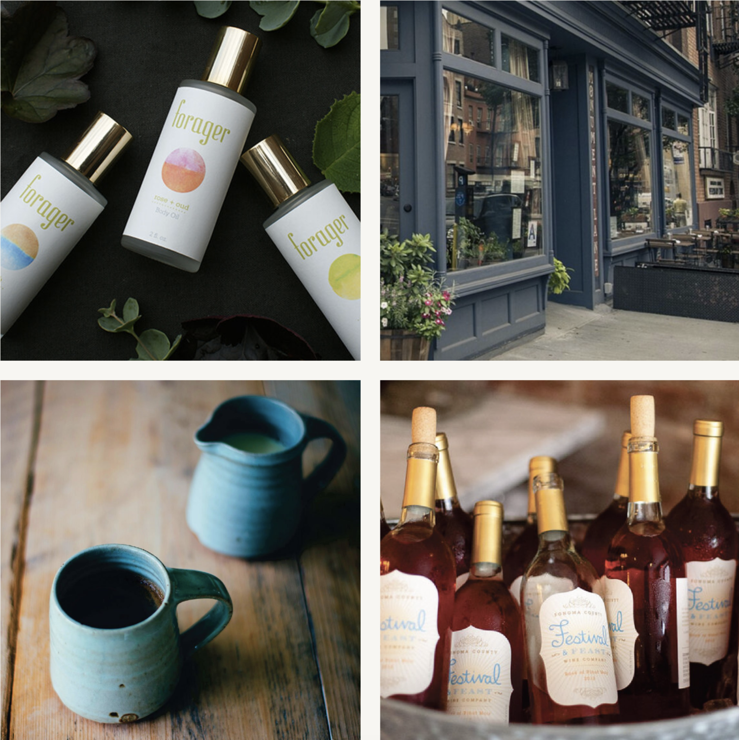
As the Spring begins to take shape I always find myself gravitation towards new color inspiration. Creating a spring color palette for your brand doesn’t only have to be used during the Spring of course but can really be used anytime of year that you see fit. In my opinion, a Spring color palette should be more muted and have cool undertones. Think of the budding flowers you see this time of year and how they are often offset by bare branches or soil. Cherry blossoms, magnolia trees etc. The light is also still relatively low light this time of year giving everything a softness to it, versus the bright harsher light of summer. I have put together some photographic inspiration so you can see the colors working together in harmony as well as some palettes that pull the colors out individually. A spring palette is a great way to infuse a sense of tranquility and gentleness into your brand or packaging. It can be great when used for female-focused brands and wellness brands depending on the types of products or services you offer.
In my color palette designs I always like to have one or two neutral colors that can be paired with any of the brighter tones as well as a few different tonal shades of color to work with. This helps design systems have a harmonious feel to them while also offering the flexibility of a lot of different combinations that can be used.


